Navigating Abrupt Shifts in Q3
The third quarter of 2025 delivered one of the sharpest leadership rotations of the year. After months of momentum-driven gains in mega-cap growth, markets turned abruptly in August, rewarding value stocks and smaller companies.
During Q3, style and size dynamics shifted quickly. For systematic large- and small- to mid-cap universes, long-horizon processes may not respond immediately to short-term sentiment; however, such processes can evaluate and rebalance over time if shifts prove persistent and are supported by fundamentals.
The defining theme of Q3 was the rotation away from momentum into value, and away from large caps toward smaller companies (Figure 1).
- Value led momentum: After dominating earlier in the year, momentum stocks lost steam, while value surged.
- SMID outpaced large caps: Smaller companies contributed meaningfully to returns as leadership broadened.
Figure 1. Size vs. Style Rotation, Q3 2025

This rotation matters because it underscores how quickly investor preferences can shift. For much of 2025, momentum was the winning trade, fueled by mega-cap growth and AI enthusiasm. But in August, sentiment favored value and smaller names, reminding investors that leadership can turn suddenly when valuations appear stretched or policy shifts alter expectations.
The rotation concentrated returns in a small subset of mega-cap growth stocks. When leadership becomes that narrow, diversified systematic large-cap exposures typically won’t mirror those few names one-for-one, which can make short-horizon comparisons less favorable.
By contrast, small- and mid-cap universes experienced broader participation, where higher dispersion can provide more opportunities for systematic stock selection to contribute.
Growth Realignment: Mag-7 Rebalance
The Mag-7, a handful of mega-cap growth stocks, also experienced a dramatic reshuffling in Q3 (Figure 2).
- Tesla, Alphabet, and Apple rebounded strongly after weaker performance earlier in the year.
- Nvidia and Microsoft cooled, despite their dominance in the first half.
Figure 2. Mag-7 Performance, Q3 vs. 1H 2025
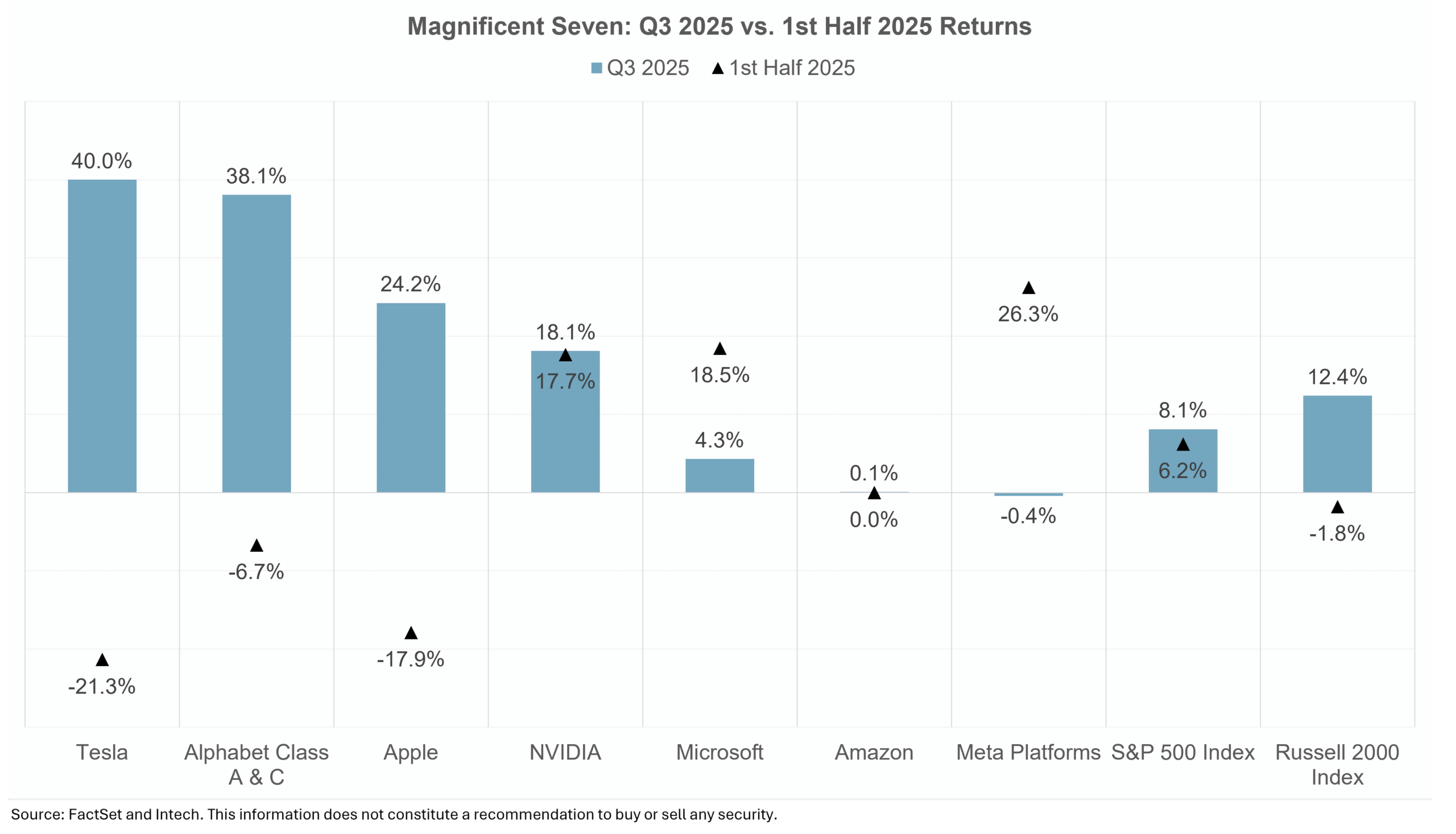
Within the mega-cap growth cohort, leadership shifted abruptly. Companies that had lagged earlier in the year—such as Tesla, Alphabet, and Apple—rebounded sharply, while prior leaders like NVIDIA and Meta cooled.
Rather than signaling a broad re-rating based on fundamentals, this reversal reflected shifting sentiment within the same narrow group of stocks. Such abrupt, sentiment-driven moves can penalize diversified systematic strategies that emphasize balanced exposures and high-quality selection.
Sector Divergence: Growth vs. Defensives
Beyond styles and mega-caps, Q3 also highlighted divergence at the sector level (Figure 3).
- Leaders: Technology, Communication Services, and Consumer Discretionary posted strong gains, reflecting appetite for growth despite elevated valuations.
- Laggards: Health Care and Consumer Staples trailed the broader index.
Figure 3. S&P 500 Sector Returns, Q3 2025
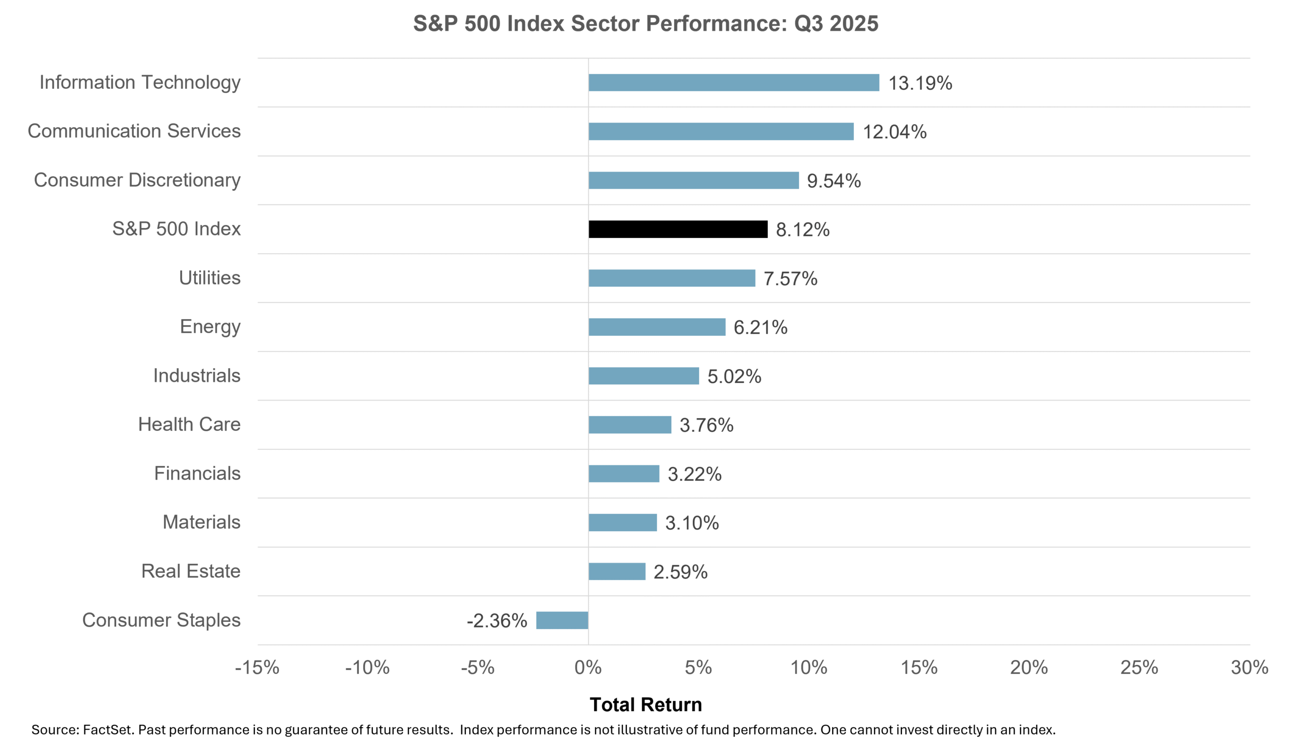
Yet averages conceal nuance. Within health care, companies adopting artificial intelligence in diagnostics and efficiency continued to present opportunities, even as the sector as a whole underperformed. This illustrates how diversification across companies can matter more than sector-level tilts alone.
Structural Shifts and Outlook
While quarterly performance grabbed headlines, several deeper currents are reshaping the investment landscape:
- Artificial Intelligence adoption: Q3 underscored a divide between AI “builders” (infrastructure providers) and “adopters” (firms applying AI to products and services). Builders attracted enthusiasm early in the year, but adopters may represent longer-term opportunities. At the same time, the energy demands and regulatory scrutiny around AI remind us that adoption will not be frictionless.
- Geopolitical fragmentation: Supply chains are being restructured in response to tariffs, trade realignment, and a push for greater energy security. This is creating regional winners and losers. Automation, reshoring, and localized production are likely to shape capital investment in the years ahead.
- Rising idiosyncratic risk: Dispersion increased during the quarter, with company-specific outcomes more influential in driving returns. Examples like Synopsys and Oracle highlighted how stock-specific fundamentals can defy sector-level trends. For systematic investors, higher dispersion creates the potential for rebalancing benefits.
- Valuations and earnings: After a year dominated by multiple expansion, future returns may rely more on earnings growth. Fiscal support remains present, but margin drivers are fading, and balance sheet strength will likely determine resilience.
Taken together, these themes suggest that volatility and dispersion may remain elevated, rewarding diversification and systematic discipline. While abrupt rotations can challenge large-cap strategies, they also create fertile ground for SMID-cap participation and long-term rebalancing effects.
What It Means for Investors
The third quarter underscored several lessons for fiduciary advisors, CIOs, and platform gatekeepers:
- Leadership can rotate abruptly. Style and size factors shifted suddenly, challenging strategies tied closely to prior trends.
- Mega-cap dominance isn’t permanent. The Mag-7 reshuffle underscored the value of diversified exposure.
- Sector results can mislead. Underperformance at the sector level may hide meaningful innovation at the stock level.
- Structural shifts matter. AI adoption, supply-chain realignment, and idiosyncratic risk are likely to shape opportunity sets beyond a single quarter.
- Systematic investing provides discipline. Long-term approaches may lag during abrupt rotations but help investors avoid chasing sentiment while positioning for sustainable shifts.
Conclusion
The third quarter of 2025 was defined by rotation and realignment. Style leadership shifted toward value and smaller companies, mega-cap growth reshuffled, and sectors diverged between pro-growth and defensive areas.
At the same time, structural changes — from AI adoption to supply-chain realignment — are setting the stage for longer-term shifts in market dynamics.
Abrupt, style-driven rotations often challenge diversified systematic large-cap exposures when leadership narrows to a few mega-cap names, while periods of broader participation in small- and mid-cap universes can be more supportive of diversified stock selection. These conditions tend to evolve as fundamentals reassert themselves over time.
Ultimately, these shifts reinforce the value of systematic discipline—maintaining diversification through changing conditions helps investors stay aligned with evolving sources of return.
Watch the full Q3 video commentary above for detailed analysis and explore how systematic approaches to U.S. large- and SMID-cap equities may complement client portfolios.