Most equity conversations begin and end with one question:
Which stocks should we own?
It’s a reasonable starting point. Businesses generate earnings. Earnings compound. Investors participate. But mathematically, that’s only part of the story.
Portfolio growth is not simply the weighted average of stock returns.
It is also a function of how those stocks interact.
That distinction is not just philosophical. It is structural.
And it potentially changes how fiduciaries think about core equity.
The Mathematical Reframe
Stochastic Portfolio Theory (SPT), developed by Intech founder, Dr. Robert Fernholz, provides a descriptive framework for understanding how portfolios compound over time.
Importantly, SPT is not a forecasting model. It does not predict earnings. It does not forecast macro outcomes. It does not assume equilibrium.
It describes what happens when securities move, and how portfolios behave as they do.
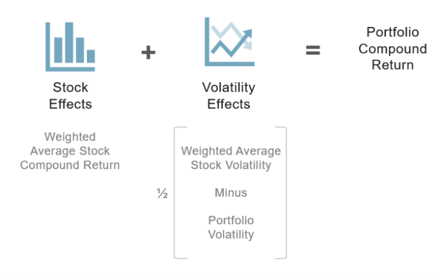
Under SPT, the long-run logarithmic (compound) growth rate of a portfolio can be decomposed into two components:
- Stock Effects
The weighted-average compound growth rate of the individual businesses.
- Volatility Effects
A structural component arising from volatility, correlations, and rebalancing.
Fernholz described this second component is sometimes referred to as “excess growth.”
Most investment frameworks focus almost exclusively on the first.
But the second exists whether we acknowledge it or not.
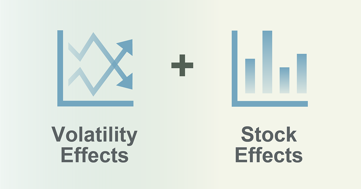
SPT: Two Engines of Compounding
The key insight: compound growth lives not only in what you own, but also in how those holdings behave together.
Stock Effects: The Familiar Engine
Stock effects are intuitive.
If you overweight businesses with durable earnings, strong balance sheets, and attractive valuations, and those fundamentals persist, returns potentially follow.
This is the foundation of traditional active management.
But there is an implicit assumption embedded in many stock-selection approaches:
That portfolio returns are simply the sum of weighted stock returns.
Mathematically, that assumption is incomplete.
Why? Because portfolios are dynamic systems.
Volatility Effects: The Overlooked Engine
Volatility effects arise from three structural forces:
- Cross-sectional dispersion
When individual stocks move differently, even if their long-run averages are similar, a diversified portfolio that refreshes weights through disciplined rebalancing has the potential of achieving a higher compound growth rate than a static allocation.
This is not about predicting volatility spikes.
It is about recognizing that dispersion exists structurally in equity markets.
And dispersion, when approached systematically, can influence compounding.
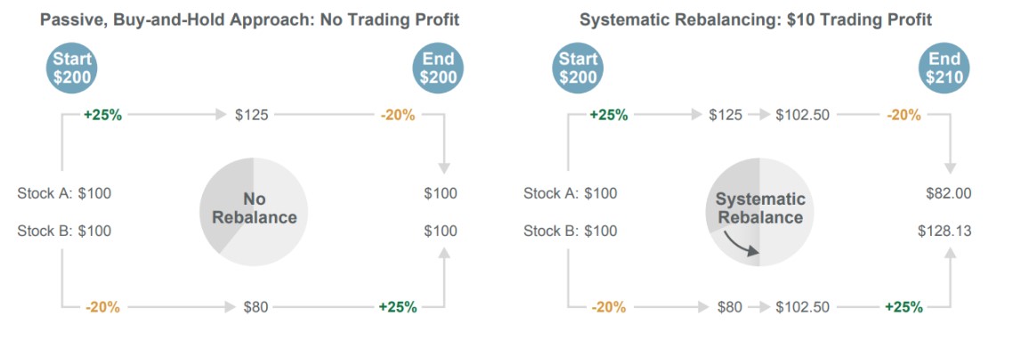
A Simple Illustration
Consider a simplified two-stock example.
Both stocks begin at the same price.
Both end at the same price.
A buy-and-hold investor earns zero excess return.
But if those stocks move in opposite directions along the way — and a portfolio rebalances back to target weights when they diverge — there’s the potential to capture incremental trading gains from their dispersion.
Below is a simplified illustration of this principle.
Rebalancing Seeks to Utilize Dispersion
Why This Matters for Core Equity
If portfolio growth depends on both:
- The compound returns of businesses
- And the interaction between them
Then portfolio construction is not just a vehicle for stock ideas.
It is a driver of outcomes.
This shifts the focus from:
“Which stocks are attractive?”
to:
“How does this collection of stocks behave as a system?”
That system-level thinking becomes especially important in benchmark-aligned core equity.
Because when leadership narrows and correlations shift, the structural interaction component can either amplify concentration, or help mitigate it.
Dispersion Is Not a Market Regime
One common misconception is that volatility effects only matter in crisis environments.
They do not.
Cross-sectional dispersion (the degree to which stocks move differently from one another) is a persistent feature of equity markets.
Some environments amplify it.
Some compress it.
But dispersion does not require crisis. It requires differentiation.
When companies have different earnings paths, different capital structures, different competitive dynamics, their stock paths diverge.
SPT formalizes how that divergence can influence compound growth.
Engineered, Not Assumed
The decomposition does not guarantee outperformance.
It does not promise downside protection.
It does not eliminate market risk.
What it does is clarify that diversification must be engineered, not assumed.
Because the volatility-effects component depends on:
If weights concentrate, interaction benefits shrink.
If correlations compress, interaction benefits shrink.
If rebalancing is absent, structural effects decay.
Portfolio structure becomes a measurable input into compounding, not an afterthought.
What Most Strategies Miss
Traditional active management often emphasizes stock effects.
Indexing often assumes diversification will occur naturally through inclusion.
Factor models focus on characteristic tilts.
Very few strategies explicitly design portfolios around the interaction between stock effects and volatility effects within benchmark-aware guardrails.
That interaction is where portfolio mathematics becomes practical.
From Academia to Application
The SPT decomposition is not an academic exercise.
It functions as a design brief.
If long-term growth has two drivers, then a systematic process should:
- Evaluate stock fundamentals.
- Assess volatility and correlation structure.
- Construct portfolios that reflect both.
- Maintain structure through disciplined rebalancing.
We offer a paper that documents how such a process can be implemented while remaining benchmark aligned and operating within defined risk parameters.
But the first step is conceptual clarity.
Compounding is not one-dimensional.
The Takeaway
Stock picking matters. But portfolio mathematics matters too.
Long-term portfolio growth reflects both business performance and structural interaction.
For fiduciaries overseeing core equity exposure, that insight reframes the conversation.
The benchmark defines the universe.
Portfolio structure influences how that universe compounds.
Understanding both engines is the beginning of governing core equity intentionally.
Explore the Full Framework